Article for the "bio/mol/text" competition: Few people know that the biophysics of sensory systems has its own name - psychophysics. One of its most interesting areas is the psychophysics of color. Color is a property of objects in the material world, perceived as a conscious visual sensation. This or that color is “assigned” by a person to objects in the process of their visual perception. This is successfully used by advertising agents all over the world. Create an advertisement, a sign so that people remember it and attract customers? Easily! Remember that when you mention a product, store or establishment, you immediately imagine its color scheme, used in advertising, in a logo or in packaging. This article explains why we are so sensitive to color advertising.
Color perception - how does it function?
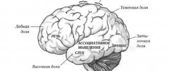
Color perception is one of the functions of vision, thanks to which a person perceives the world in all its variety of colors and shades. The refractive system of the eye and the retina, on which light rays are collected after refraction by the lens and cornea, are responsible for image formation. The color of the picture is determined by the central point of the retina - the macula, or more precisely, the cones. These photoreceptors provide color vision and are involved in photopic (daytime) vision.
There are three primary colors in nature: red, green, blue. The entire variety of shades, of which there are several tens of thousands, is formed by mixing these three main tones. This theory was put forward by Lomonosov in 1756. T. Jung conducted his research in the same direction. Subsequently, the idea of three-component color perception was supplemented by G. Helmholtz and his students. There are three types of cones, each containing a specific pigment. In other words, the macula contains blue, red and green cones. In this case, color waves, regardless of their length (spectrum), immediately affect the entire cone apparatus. If there are any defects in it, the color perception will be incorrect. In this case, we are talking about color vision disorders. They are caused by pathologies of the optic nerve, retina, and nervous system.
Color vision disorders are rare. Approximately 8% of all men have congenital impairments of this visual function, but this does not mean that they cannot distinguish colors at all. In most cases, one of the spectra is not available to them. In women, problems with color perception are even less common (approximately 0.5% of cases). Color vision disorders can create some difficulties when choosing an activity. Information is often presented in the form of color signals - in transport, industry, agriculture and other areas.
What's inside?
What happens in the body itself when we see any color? How does our brain react to the colors of the world around us? It turns out that the outer segments of the rods of the retina of humans, marine invertebrates, fish and almost all terrestrial vertebrates contain a basic visual pigment called rhodopsin. It is also called visual purple because it becomes purple in color after absorbing green or blue light.
See also: “Visual rhodopsin is a receptor that responds to light” [8].
Rhodopsin best absorbs light wavelengths of 500 nm, while the absorption of color-sensitive cone pigments of various types occurs in the region of 420 nm (blue light), 531 nm (green) and 558 nm (red). When light is absorbed, the conformation of the protein part of rhodopsin changes, and it activates the G-protein transducin, which triggers the enzyme cGMP phosphodiesterase. As a result, the concentration of cGMP in the cell drops and sodium channels close. As sodium ions are constantly pumped out of the cell by ATPase, their concentration within the cell rapidly drops, causing hyperpolarization of the visual membrane. As a result, the photoreceptor releases less of the inhibitory transmitter glutamate, and nerve impulses arise in the bipolar nerve cell, which is “disinhibited.”
See also: “Receptors in active form” [9].
This is why colors with longer wavelengths have the greatest impact. For example, red has the longest wavelength. An exciting, warming, active and energetic color, it penetrates and activates all body functions: stimulates nerve centers, energizes muscles.
Of course, many epithets here should be taken purely figuratively. - Ed.
Blue color, on the contrary, has the shortest wavelength - therefore it calms and slows down the body's nervous system. Recommended in therapy for emotional and nervous people, however long-term exposure to blue can lead to depression.
The influence of color on a person
Today, psychologists also study the problem of the influence of color on humans. From their point of view, certain shades carry emotional information and, therefore, participate in the formation of mood. Such data can be used to make your image more attractive, your environment more comfortable, and your products and services more salable. Colors can be used in the treatment of diseases of the nervous system, in marketing and other areas. Many people are skeptical about this. Indeed, such theories are difficult to study and cannot always be scientifically proven. However, they should not be completely rejected. Let's find out what they are, how colors influence a person and his life.
Use in advertising
Each color is capable of shaping a person’s emotions, and this feature is actively used in the advertising industry. For example, red attracts attention and encourages purchase. Orange promotes a surge of vitality and an increase in optimistic tone, so experts recommend using it in advertising of medicines.
Yellow tones promote communication skills, which allows them to be used in advertising of travel services and PR agencies. Blue details help to quickly attract the buyer's attention and, unlike red, this color never causes negative emotions.
As for the green color scheme in advertising, it has a healing, relaxing effect. Advertising in green colors will be effective and appropriate for medicines, veterinary hospitals, dental clinics, health centers and water treatment systems.
Features of color perception
Human perception of color is subjective. Some people like warmer shades, others prefer cool tones. Moreover, the same color can be perceived differently by people. Of course, there are general patterns. So, according to survey results, most people love the color blue. Why him? What determines the choice of shade?
There are three theories to explain this issue:
- evolutionary;
- theory of gender schemas;
- ecological valence theory.
What is the essence of each of them?
Biology or evolution. According to this theory, biological mechanisms formed during evolution determine human color preferences. So, initially the color blue was associated with the night, and therefore with calmness and passive pastime. Yellow hues, which resemble the sun, correlated with activity. Why, then, do men like blue and women like pink? These differences were caused by evolutionary changes that occurred during the times of gathering and hunting. In the early era, women had to cook food and pick fruit. They are mostly red and yellow and stand out well against the green foliage. It is for this reason that the fair sex prefer all kinds of shades of red and yellow. Proving this theory is quite difficult. The other two hypotheses explaining color preferences look more convincing.
Gender schema theory. The formation of color preferences is influenced by gender. This is what the supporters of this theory say. From a psychological point of view, color perception is established in childhood, as soon as the child begins to realize his gender identity. After this, they search the world for information, including colors, that is associated with their gender. Parents reinforce gender stereotypes. They dress boys in blue or dark colors, girls in pink. Because of this, girls subsequently gravitate towards this color, and guys towards blue. A study was conducted in which specialists observed children from 7 months to 5 years. The boys became more and more distant from pink tones the more they learned about their own gender. The same pattern was found among girls. They increasingly preferred pink shades.
Ecological valence theory. The previous concepts partially explain people's color preferences. But these theories are general. They are not able to answer the question why a person loves dark blue, light blue, soft pink and other shades. Where does such a variety of tastes come from? The theory of ecological valence tried to answer this question. According to her, color perception is formed on the basis of emotional experience. A person will like more those shades that he associates with something positive, joyful, and pleasant.
To prove this theory, scientists conducted a study. In it, subjects were offered two pens of different colors with musical accompaniment. One color was accompanied by unpleasant music, the second by positive music. Most people chose pens that were associated with good music. The advantage of this theory is that it does not reject the ideas of its predecessors who formalized the theory of gender schemas. Please note that boys are often given blue toys, and girls are given pink ones. Toys evoke positive emotions. In the future, color will only be associated with good things. According to the ecological valence, which gave the theory its name, we understand the ability to adapt to environmental factors.
Video description
About choosing a color palette for the interior in the following video:
Violet (lilac)
The lilac color in the interior is called mystical, majestic and luxurious; The influence of this shade on a person is multifaceted. In the color wheel, violet is formed at the junction of warm red and cold blue, which indicates its internal contradiction.
Purple encourages leisurely reflection and allows you to give free rein to your dreams. It is used strictly in doses - most people, surrounded by an excess of purple, quickly get tired. The living room and bathroom are decorated in cool shades; additional contrasting colors (often white) are chosen for the bedroom. It is not advisable to use purple in the decor of the kitchen, dining room, nursery or hallway.
Pale lilac bedroom decor Source i1.wp.com
Brown
It is considered neutral, can be successfully used in different styles, and can be combined with most shades. An interior with a predominance of brown creates a feeling of security and stability. It is perfect as a base for decorating a bedroom, kitchen, hallway, or living room.
Cozy and reliable Source www.agrpaper.com
Grey
A universal color that is especially convenient to combine with rich and catchy shades. As a background, it can elevate and bring harmony to the most unpresentable space, from the bedroom to the living room. Gray should be used carefully as the main color: most people will find such an interior boring and dull.
Almost round gray Source img.mp.itc.cn
Human perception of colors and their meanings
The emotional background that surrounds a particular shade can be explained by the theory of environmental valence. However, it is powerless in understanding the problem of the semantic meaning of color. Why is each of them associated with something? For example, red - with passion? The theory of associative networks provides answers to such questions. A network of interconnected knowledge develops in the brain over the course of a person’s life. They are based on emotions, sensory experience and semantic meaning. In this theory, these factors are called “nodes”. Each color has its own node in the brain. It can change over the course of life, that is, as a result of gaining new experiences. Important events form strong knots. So, for example, if a person was hit by a red car, a node of this particular tone will form in the head. It will be associated with certain emotions. Subsequently, other feelings may be added to them.
Psychologists often assign color one meaning or another. Blue is considered calm, black is down-to-earth, and yellow is cheerful. Actually, this idea of colors is common to many, but color psychology itself is not so simple. There is no single meaning that would describe color as completely and succinctly as possible. People can attach completely different conflicting meanings to a particular shade based on their own experiences. For example, funeral service workers are accustomed to being among black objects. It is not surprising that they associate them with grief. People who like to ski perceive the color white positively. It is associated with snow and the pleasant emotions received during skiing.
These are not all the factors influencing the perception of color. Culture plays an important role in this. There are some regularities: in the West, people prefer blue. In the East, this same color is perceived as cold; it is associated with negativity and even evil. Many peoples of Africa perceive white as a negative color, while black, for obvious reasons, is preferable for them.
There is another significant factor - context. In everyday life, many people associate the color red with passion. During the years of revolution, red tones symbolize the blood shed by the people. Why is it important to study such questions? How can this information benefit you?
Firstly, it will be easier for each person to organize their workspace or everyday life. Knowing your color preferences and the tastes of your relatives, you can create a more comfortable atmosphere at home. Secondly, studying color perception can be useful in marketing. Before you start selling your product, research your target audience. When selling pots and pans, you can choose black color for the handles - in this case it is more practical. Thirdly, colors help heal. Color therapy is based on this position. A specialist can find out which shades are positive and negative for a person, and then use them to influence the patient’s psycho-emotional state.
Use in clothing
The predominance of one color in clothing tells a lot about a person. It is believed that in this way he shows his mood to the outside world. If, when purchasing any item of clothing, a person unconsciously chooses green shades, it means that he has a light, pleasant character, and is always ready to cooperate and communicate.
Delicate and rich green tones, especially if combined with orange or yellow, indicate cheerfulness and activity. In turn, wearing clothes of such colors helps to increase the vitality and energy of its owner. Therefore, if you feel a lack of energy, a loss of strength, then to activate your internal potential you can combine green, orange and yellow things.
Dark green shades in clothes indicate that their owner is a detached, withdrawn person who prefers to live in solitude and solitude. Things in dark green tones have a calming effect, so you can wear them when you are in a nervous state.
How can you make a color “good”?
So, it was previously noted that human perception of colors is subjective. Everyone can see different shades, associating them with good or bad emotions. But at the same time, almost any color can be made positive. When choosing a shade, consider three factors: appropriateness, aesthetics, and meaning. The meaning of color was discussed above. As for relevance, everything is quite simple here. For example, it is better to choose a brown table rather than a blue one. Aesthetics is a more complex factor. It is important to rely on good taste here. When decorating an apartment or office, or selecting clothes, take into account the opinions of designers, stylists and other specialists in this matter.
Color therapy is not a science, but a teaching, one of the methods of treatment. However, it cannot be template. Psychologists are constantly studying the problem of human perception of color. On the one hand, you yourself can try to determine how this or that shade affects your mood. On the other hand, there are no absolute laws. Preferences may change over the course of a lifetime.
Interior use
Green colors in the interior help create a relaxing atmosphere, which is why it is often used when decorating meditation rooms and bedrooms. However, in the latter case, the predominance of green colors can lead to problems with waking up in the morning.
From the point of view of Feng Shui, green colors in the interior symbolize financial wealth, abundance, hope, and personal development. They give additional energy and inner balance. Green color is able to dispel negative energy, so it is often used in hospitals and public institutions.
Decorating an office or children's room in green colors will help increase concentration and improve a child's learning ability.